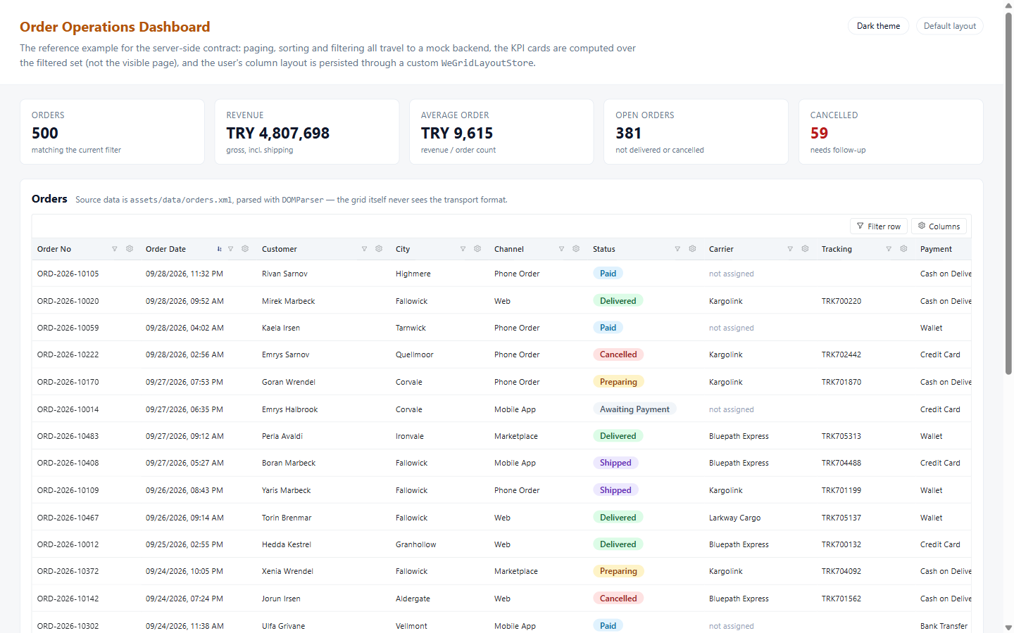
500 orders, one page at a time
The grid never pages by itself. It renders the rows you hand it and reports what the user asked for — page, sort, filter — as events. Here the mock backend answers each one, and the KPI cards above the grid are computed over the whole filtered set, not the 25 visible rows.
Everything the end user is allowed to change
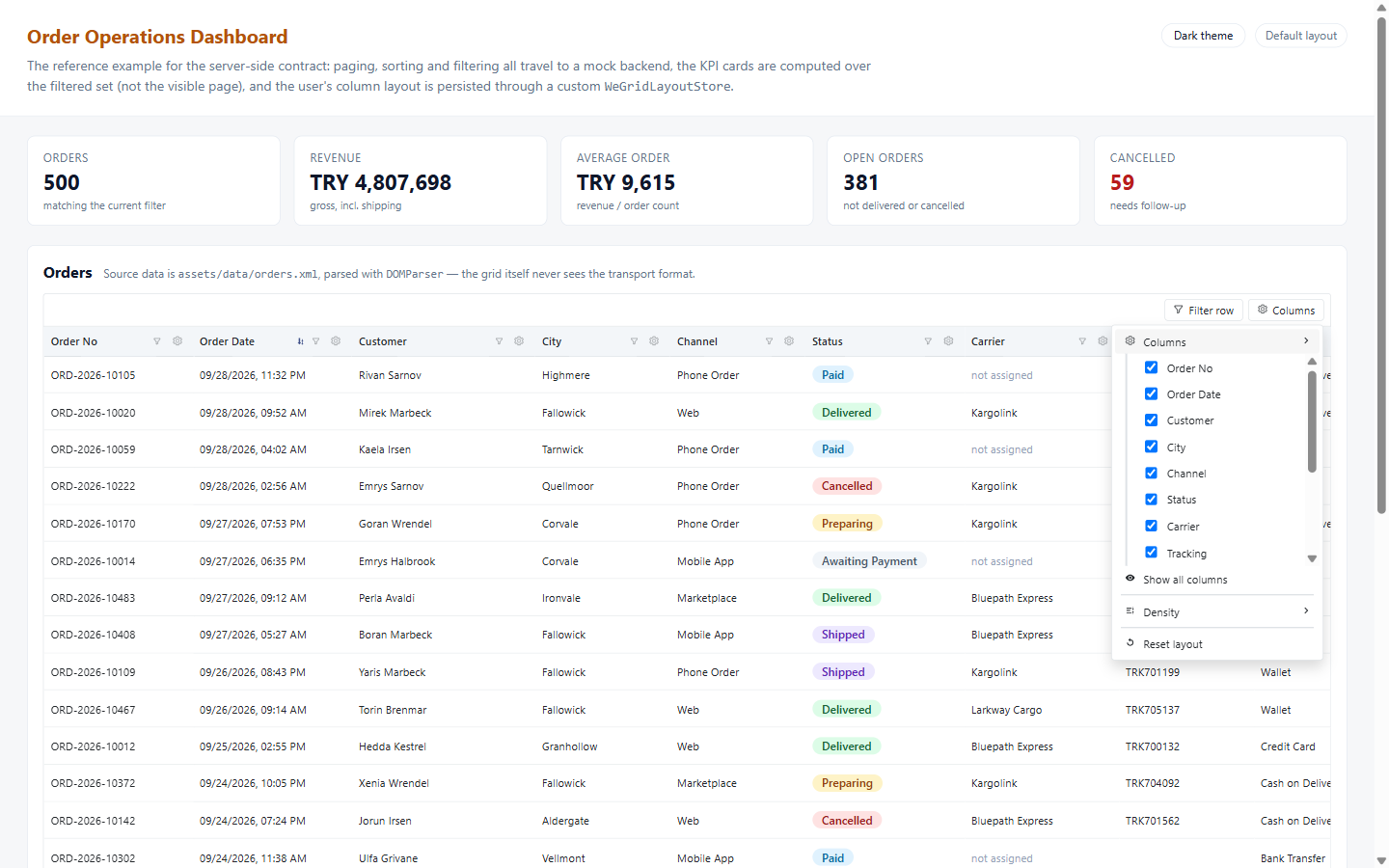
Right-click a header — or use the gear button on it — and the whole column vocabulary is there: hide, rename, pin, sort, fit width to content, pick a subtotal function, switch density, group by this field, reset. No host-app wiring; the grid owns this menu.
Filter row, chips, and totals that follow
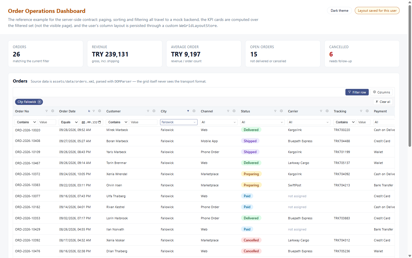
Free-text, date and amount columns get an operator and a value; closed-set columns like
City get a checklist button. Active filters collapse into removable chips above the
header. Ticking Fallowick in City takes 500 orders down to 26 — every page of
them, because the filter runs on the backend — and the revenue and cancellation figures
move with it. The pill on the right flips once a layout has been saved for this user.
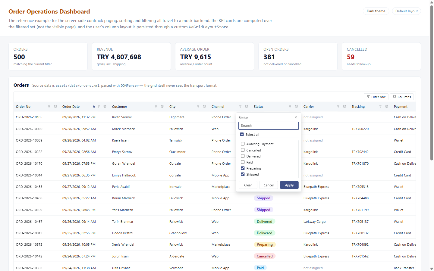
Tick the values, not the operator
Every filterable column's funnel opens this by default: the distinct values — here of every
order, through checklistValuesProvider, not just the loaded page — searchable,
with a select-all box and an entry for blanks — and the selection leaves as a single 'in' filter
carrying the raw codes, which the backend turns into one IN (…) over every
order. The labels come from the column's displayValue, so the user ticks
"Shipped" while the query gets 40.
Grouped, subtotalled, and selected
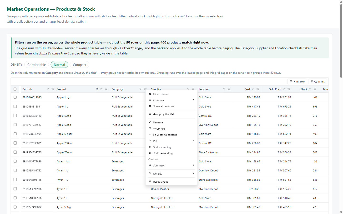
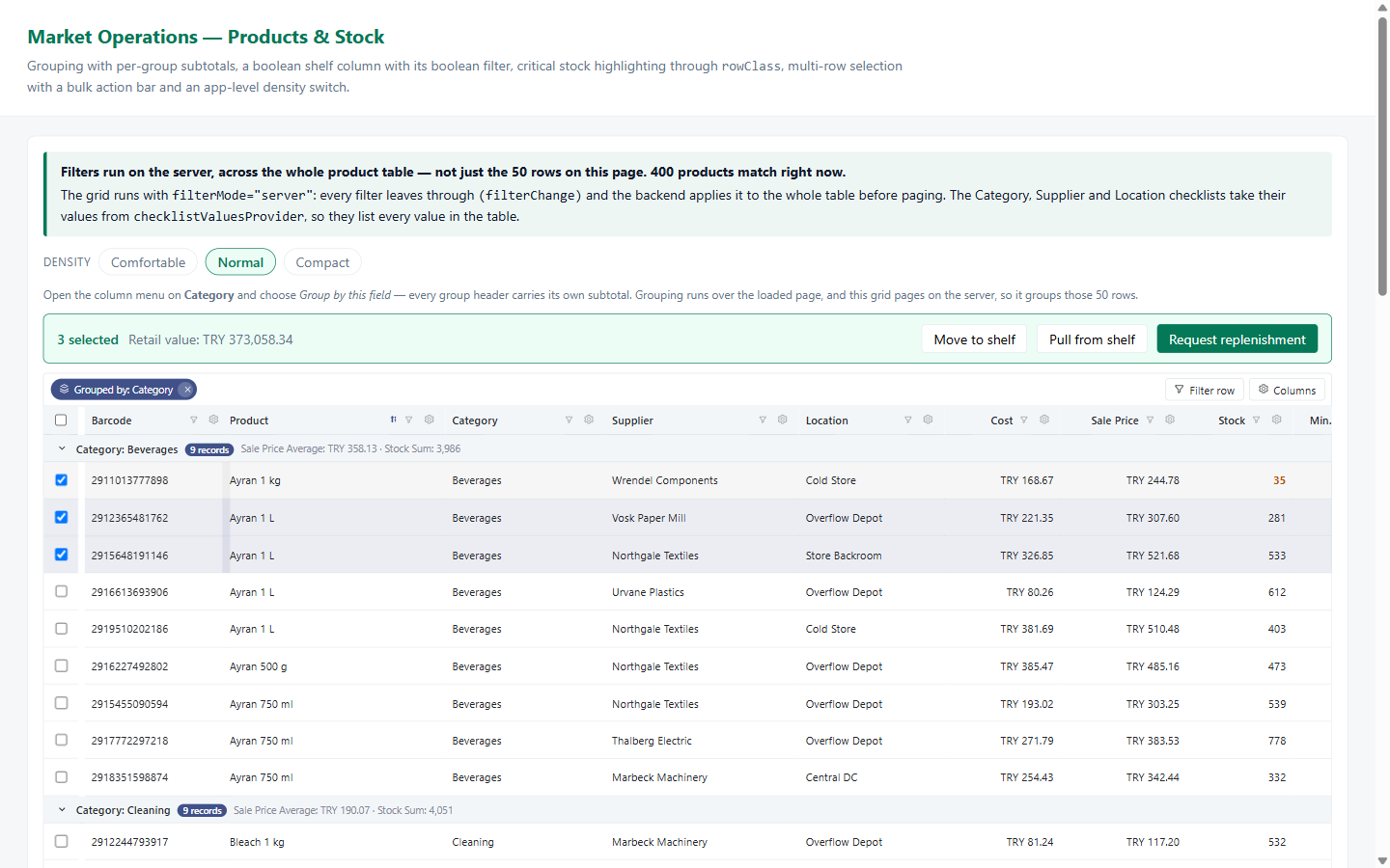
Grouping by a column turns the body into collapsible sections, each header carrying its own subtotals — here a sale-price average and a stock sum per category. Selection is the host app's business: the grid reports it, the sample turns it into a bulk action bar with the retail value of what is ticked. The note above the grid is the other half of this sample: filters and checklists cover all 400 products on the server, not the 50 on screen.
A row that opens into its own breakdown
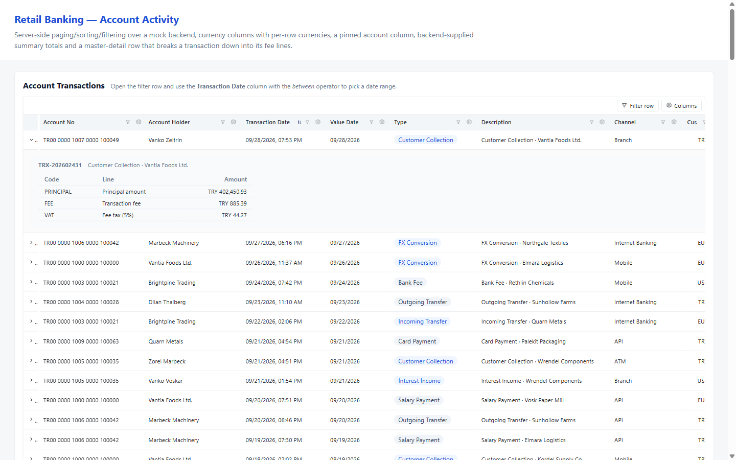
Master-detail is an Angular template you project into the grid, so the detail area is ordinary markup in your component with your own styles applied. The account number column stays pinned to the left while the rest of the table scrolls sideways under it.
Dark mode is one attribute
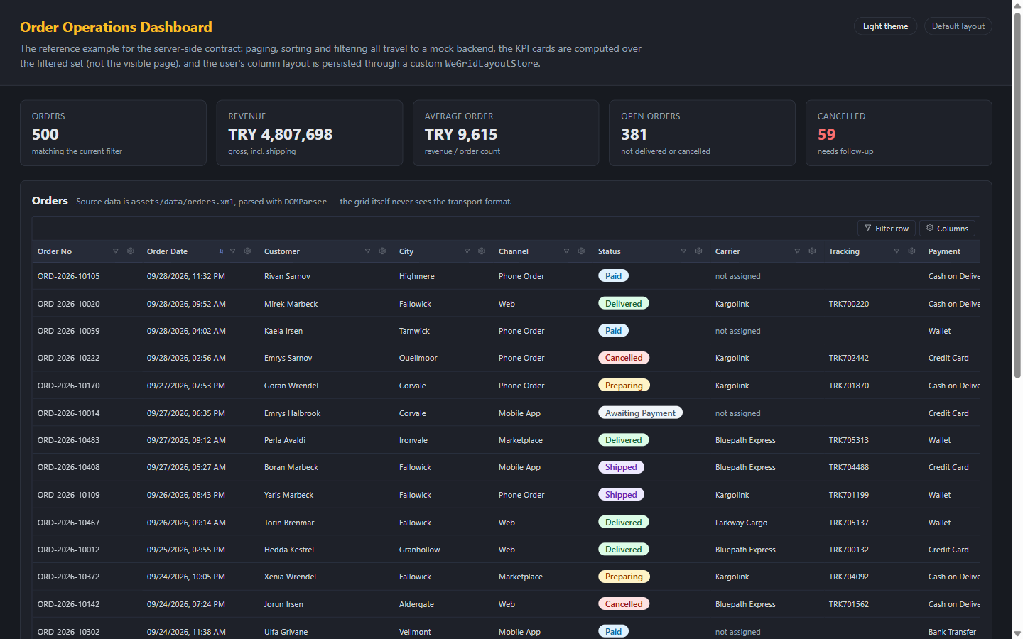
Every colour in the grid is a --we-grid-* custom property. Setting
data-theme="dark" on any ancestor switches the whole set; leaving it off
follows the operating system instead. There is no theme input, no second stylesheet, and
nothing to rebuild — override the properties and the grid is in your brand.
The layout belongs to the user, not the code
Which columns are visible, how wide they are, what they are called, where they are pinned
and in what order — all of it is saved under the grid's gridKey and restored
on the next visit. localStorage is the default; implement one interface and it goes to
your backend per user instead.